SaaS · 2025
11 steps to 4, conversion doubled
A redesign of an AI faceless-video SaaS that took free-to-paid conversion from 4.2% to 9.1% by rebuilding the creation flow mobile-first.
4.2% → 9.1%Free-to-paid conversion, six weeks post-launch
- Role
- End-to-End Product Designer
- Client
- RiseAngle
- Duration
- 3 months
- Year
- 2025
- Figma
- ChatGPT

Context
- The business
- RiseAngle lets creators make and schedule faceless TikTok and YouTube Shorts using AI — no filming, no editing. It had grown to tens of thousands of active creators on a product built desktop-first.
- What was wrong
- 73% of usage was mobile, on an interface designed for a desktop browser. Creating one video took eleven steps, template browsing was a form rather than a gallery, and the paywall was a lock screen with no explanation attached. Free users were not converting, and many were abandoning the creation flow before finishing a single video.
- What I did
- I started with an analytics audit rather than a redesign, then rebuilt the three screens the numbers pointed at: an eleven-step flow became a four-step mobile wizard with bottom sheets and an inline live preview, the template picker became visual-first, and the paywall became a value-first upgrade path.
- An existing user base of tens of thousands meant the redesign had to be recognisable, not a reset.
- AI generation latency is a real technical floor — it could be designed around, not removed.
- Both platforms had to ship, so nothing could depend on mobile-only or desktop-only behaviour.
What changed
4.2% → 9.1%
Free-to-paid conversion, six weeks post-launch
42% → 79%
Flow completion rate
58% → 24%
Mobile session drop-off
The work
01
Audit before redesign
I started in the analytics rather than in Figma: where sessions ended, which steps were abandoned, what device they were on. That is what surfaced the 73% mobile split and pointed at the paywall — a screen I would not have prioritised on instinct.
02
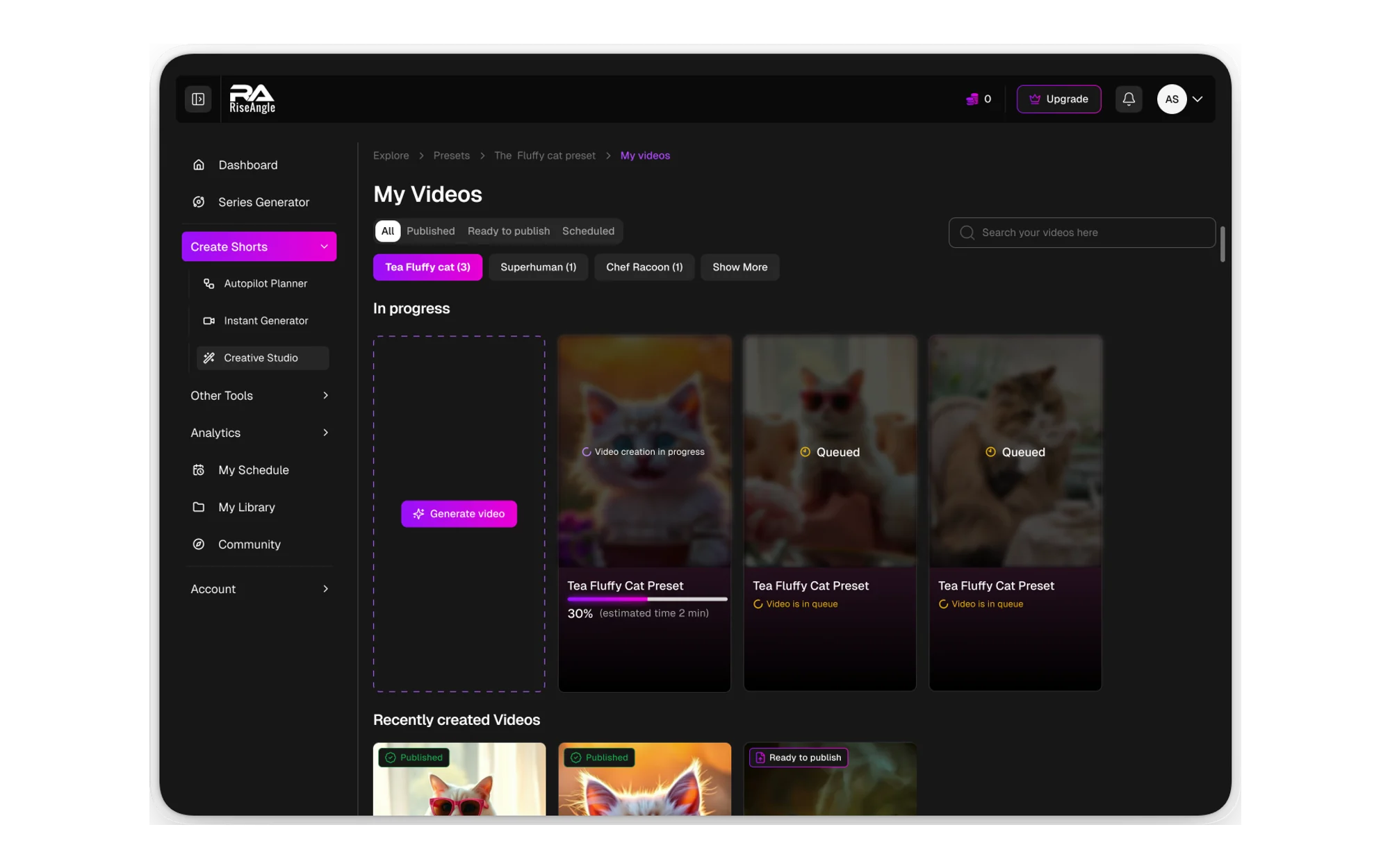
Eleven steps down to four
The creation flow became a mobile-first wizard using bottom sheets, so each decision arrives one at a time with the previous choice still visible. Everything that could be defaulted was defaulted, and everything optional moved out of the critical path.
03
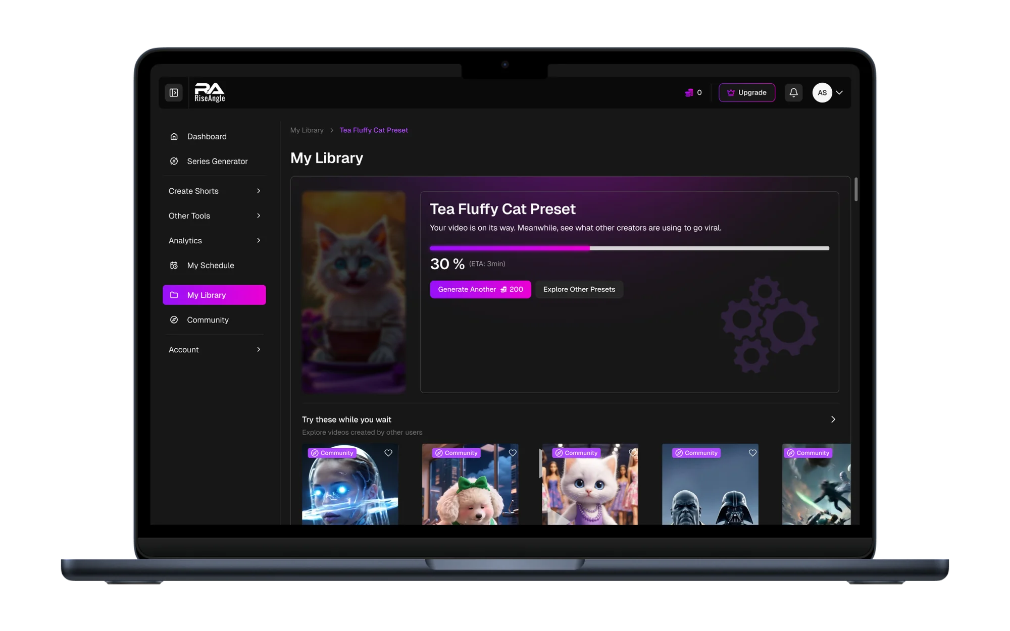
Generation latency as a design surface
Rather than hiding the wait, the flow shows an inline live preview while the video builds. The wait becomes the moment the creator sees it working, which is the opposite of a spinner — and it turned the product's biggest technical constraint into a reason to stay on the screen.
04
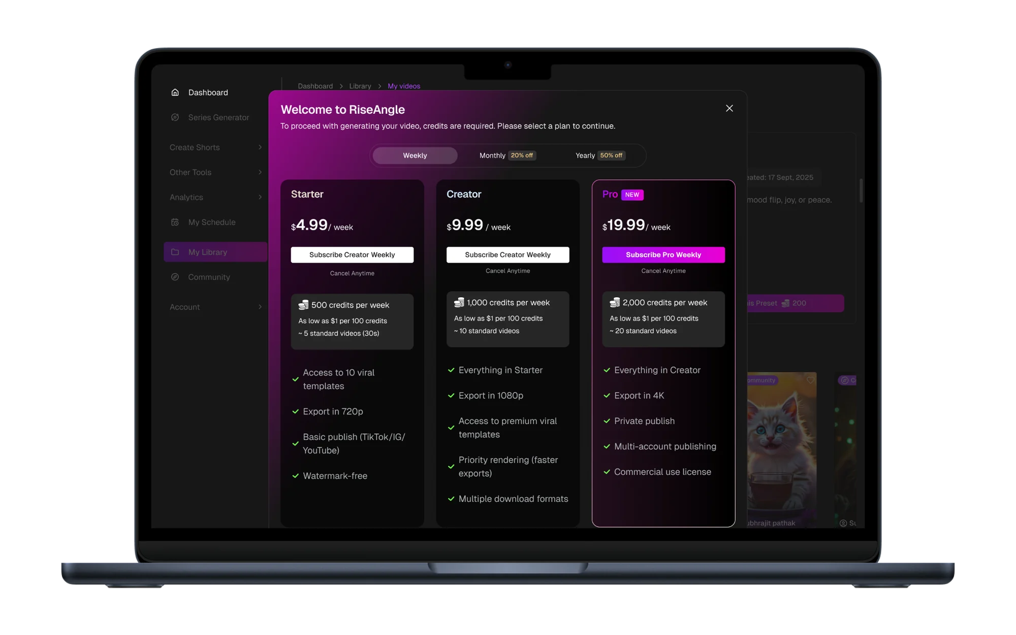
A paywall that makes the case first
The lock screen became a value-first upgrade path: what the plan unlocks, priced against what the creator was already trying to do, shown at the point they were trying to do it. This single change accounted for roughly a third of the total conversion lift.
Final design
Three flows. One experience that works on every screen.
The creation wizard, the visual template gallery and the upgrade path — the three screens the analytics pointed at, running on a phone.
Create a video
Browse templates
Upgrade to Pro
Before and after
Before · 7 steps
- 01Browse templates
- 02Configure form
- 03Set voice
- 04Set captions
- 05Set schedule
- 06Review
- 07Generate
After · 4 steps
- 01Pick a preset
- 02Add prompt
- 03Generate with live preview
- 04Publish
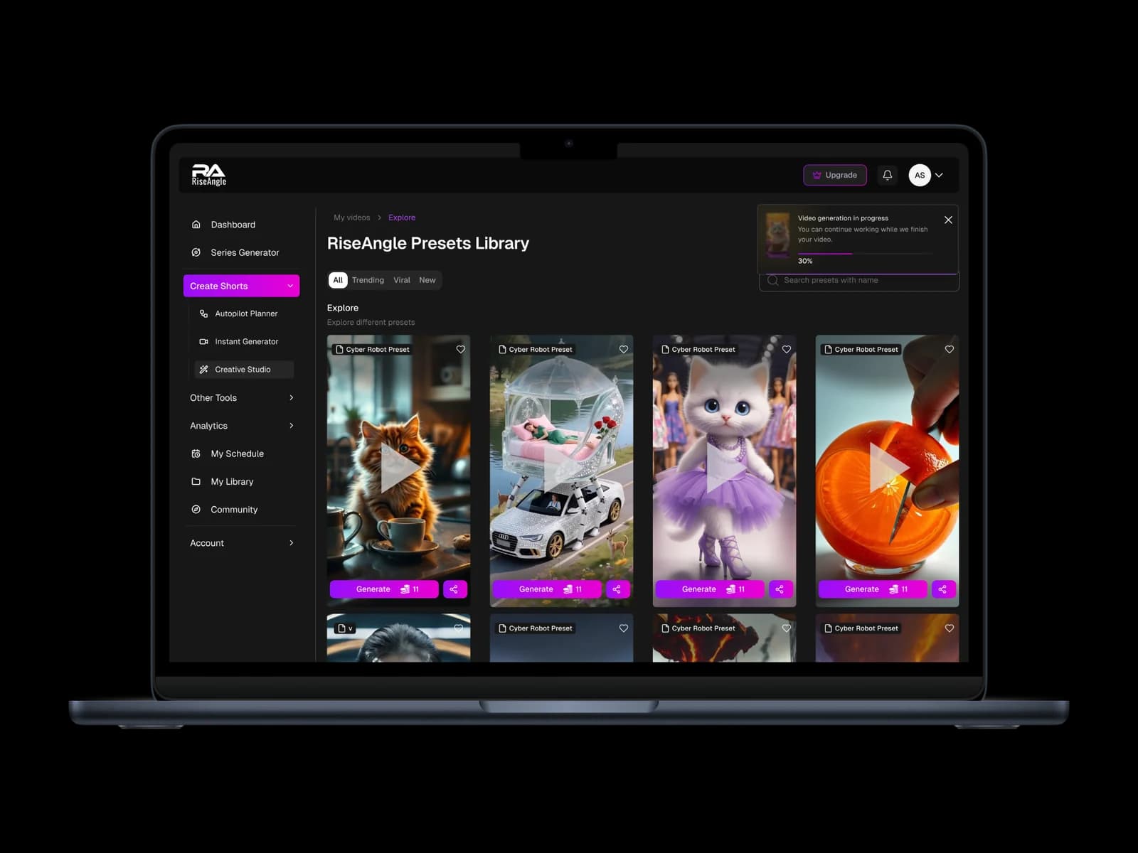
More screens
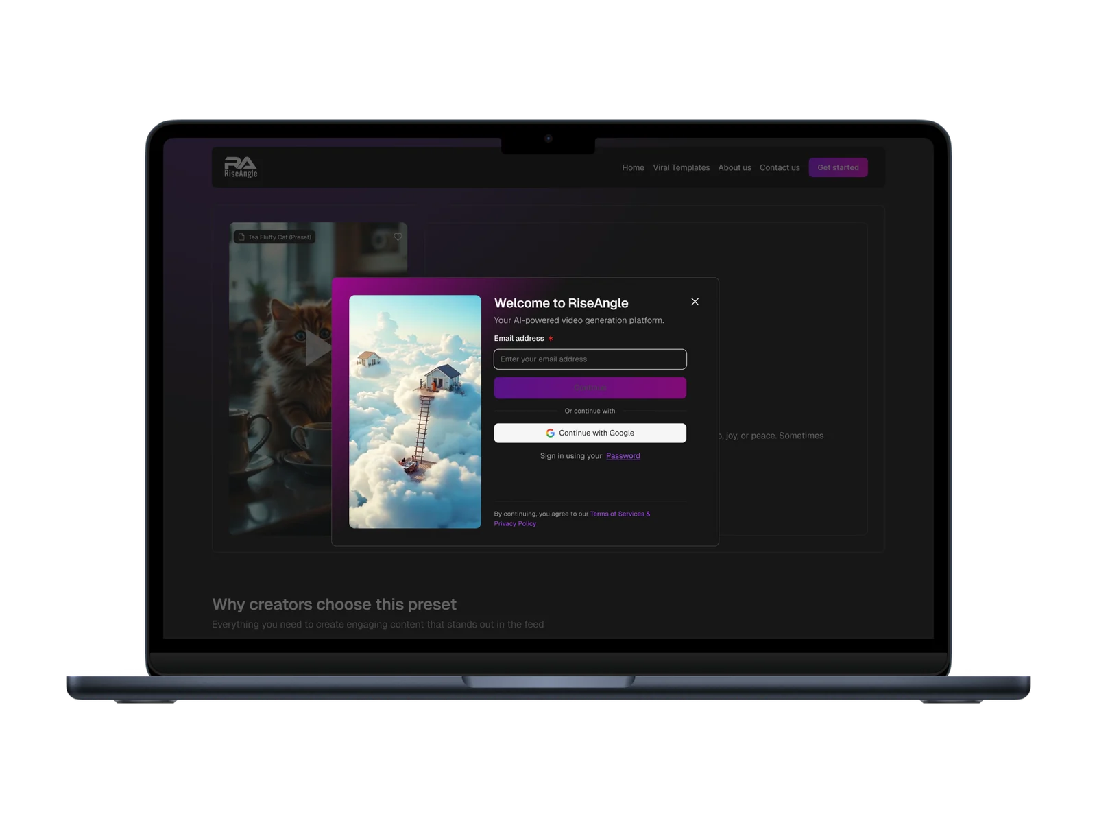
The outcome
Six weeks after launch, conversion had more than doubled and completion had nearly doubled with it. The more useful outcome for me was the order of operations: the audit found the paywall, and the paywall was the single highest-return screen on the project. Designing what looked broken would have missed it.
4.2% → 9.1%Free-to-paid conversion, six weeks post-launch
- Analytics before Figma: the highest-return screen on this project was not the one my instinct pointed at.
- Designing around a real technical constraint — generation latency — produced a better experience than hiding it would have.
- Value-first framing at the paywall mattered more than expected, and it cost nothing to build.
Next case study
Modal wizard to a visible decision tree